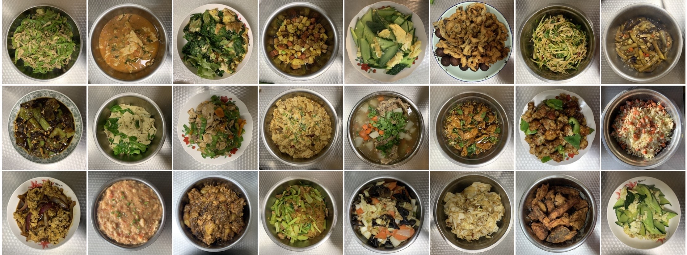
吃喝玩乐
切成小块的豆腐焯水后沥干,等开炒时又凝固成一大块了🤣
按照 B 站段小段美食教程的菜谱,挑战做了溜肉段,真的很脆很好吃。
手机刚到手,成色又好价格又便宜的二手机纷纷涌现,可恶。
帮朋友选手机做了个表格,干脆也放到这供大家参考,这里头看参数最推荐的还是小米 14 和 Vivo X100。
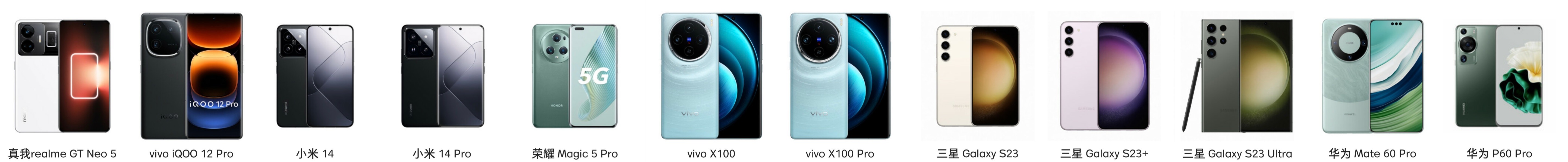
| 机型 | realme gt neo 5 | iqoo 12 pro | 小米 14 | 小米 14 pro | 荣耀 magic 5 pro | vivo x100 | vivo x100 pro | 三星 s23 ultra | 华为 mate 60 pro |
|---|---|---|---|---|---|---|---|---|---|
| 处理器 | 骁龙 8+ gen 1(降频) | 骁龙 8 gen 3 | 骁龙 8 gen 3 | 骁龙 8 gen 3 | 骁龙 8 gen 2 | 天玑 9300 | 天玑 9300 | 骁龙 8 gen 2 for galaxy | |
| 屏幕刷新率 | 144 hz | 144 hz | 120 hz | 120 hz | 120 hz | 120 hz | 120 hz | 1-120 hz | 1-120 hz |
| 屏幕尺寸 | 6.74 英寸 | 6.78 英寸 | 6.36 英寸 | 6.73 英寸 | 6.81 英寸 | 6.78 英寸 | 6.78 英寸 | 6.8 英寸 | 6.82 英寸 |
| 重量 | 199 g | 210 g | 193 g | 223 g | 219 g | 206 g | 225 g | 233 g | 225 g |
| 相机前摄 | 1600 万 | 1600 万 | 3200 万 | 3200 万 | 1200 万 | 3200 万 | 3200 万 | 1200 万 | 1300 万 |
| 相机后摄 | 5000 万 | 5000 万 | 5000 万 | 5000 万 | 5000 万 | 5000 万 | 5000 万 | 2 亿 | 5000 万 |
| 电池 | 4600 mAH | 5100 mAH | 4610 mAH | 4880 mAH | 5450 mAH | 5000 mAH | 5400 mAH | 5000 mAH | 5000 mAH |
| 有线无线反向 | 240 w | 120 w | 90 w + 50 w + 10 w | 120 w + 50 w + 10 w | 66 w + 50 w + 支持 | 120 w | 100 w + 50 w + 10 w | 45 w + 15 w + 4.5 w | 88 w + 50 w + 20 w |
| 发售时间 | 2023年2月 | 2023年11月 | 2023年10月 | 2023年10月 | 2023年3月 | 2023年11月 | 2023年11月 | 2023年2月 | 2023年9月 |
| 16 + 256 | ¥4,999 | ¥4,299 | ¥5,299 | ¥8,499 | ¥7,799 | ||||
| 16 + 512 | ¥5,499 | ¥4,599 | ¥5,499 | ¥5,899 | ¥4,599 | ¥5,499 | ¥9,499 | ¥7,999 | |
| 16 + 1024 | ¥2,350 | ¥5,999 | ¥4,999 | ¥5,999 | ¥4,999 | ¥5,999 | ¥11,000 | ¥8,788 | |
| 备注 | 配置全面,建议等降价 | 小屏旗舰 | 屏幕京东方、维信诺抽奖 | 影像旗舰,有长焦,屏幕京东方、维信诺抽奖 | 屏幕京东方、维信诺抽奖 | 内存是 12 +,好像不支持红外 | 配置一般,不推荐 |
realme gt 5 pro、一加 12 两款手机也不错。
博客
博客双向友链 + 1 → Sleepingcat 💕 ,已经有五位双向友链了,好开心!
更新友链时 push 失败,第二天中午才发现没推上去,重设下代理就好了。
参考文章:解决 Github port 443 : Timed out
# 重设代理(端口和 IP 修改为电脑 设置 —— 网络和Internet —— 代理 —— 地址、端口)
git config --global http.proxy http://127.0.0.1:7890
git config --global https.proxy http://127.0.0.1:7890
# 取消代理
git config --global --unset http.proxy
git config --global --unset https.proxy
# 查看代理
git config --global --get http.proxy
git config --global --get https.proxy
还发现个小问题:搜索无法正常使用,显示 404 There isn’t a GitHub Pages site here.
按照之前 [hugo stack 主题美化#RSS]
中的修改方法替换 {{ .Permalink }} 为 {{ .Permalink | relURL }} 即可解决。
(这个 Permalink 问题的出现可能和我的 Github 仓库是私有有关系?当初建站的时候稀里糊涂地就以私有仓库搭建完成了 😵)
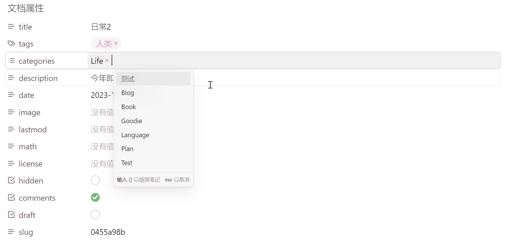
Obsidian
两三年过去,用得还是稀里糊涂,完全没发挥出双链的功能,花四五天的时间按照 P.A.R.A. 重新整理笔记。
新加的 Property 功能给博客打标签和分类都更方便了:
Dataview 卡片
文章前 yaml 添加 cover 项,存放书籍封面 url:
dataview 所在页如下填写:
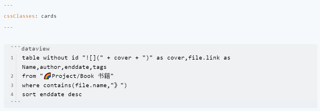
注:卡片和表格视图下进行筛选,需要在社区插件市场下载安装 Sortable 插件。
样式 1
参考示例库 → PKM-er/Blue-topaz-example
比较美观,效果如下:
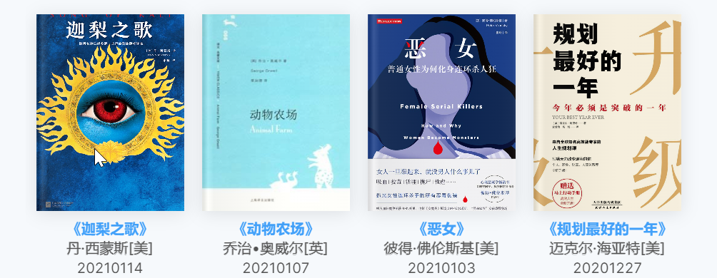
设置 —— 外观 —— CSS 代码片段 —— 打开所在文件夹 —— 新增 【卡片视图】cards.css
/* Adapted from Minimal theme by @kepano */
/* Required by @kepane, this is his `buy me a coffee` page https://www.buymeacoffee.com/kepano */
/* MIT License

Copyright (c) 2020-2022 Stephan Ango (@kepano)

Permission is hereby granted, free of charge, to any person obtaining a copy
of this software and associated documentation files (the "Software"), to deal
in the Software without restriction, including without limitation the rights
to use, copy, modify, merge, publish, distribute, sublicense, and/or sell
copies of the Software, and to permit persons to whom the Software is
furnished to do so, subject to the following conditions:

The above copyright notice and this permission notice shall be included in all
copies or substantial portions of the Software.

THE SOFTWARE IS PROVIDED "AS IS", WITHOUT WARRANTY OF ANY KIND, EXPRESS OR
IMPLIED, INCLUDING BUT NOT LIMITED TO THE WARRANTIES OF MERCHANTABILITY,
FITNESS FOR A PARTICULAR PURPOSE AND NONINFRINGEMENT. IN NO EVENT SHALL THE
AUTHORS OR COPYRIGHT HOLDERS BE LIABLE FOR ANY CLAIM, DAMAGES OR OTHER
LIABILITY, WHETHER IN AN ACTION OF CONTRACT, TORT OR OTHERWISE, ARISING FROM,
OUT OF OR IN CONNECTION WITH THE SOFTWARE OR THE USE OR OTHER DEALINGS IN THE
SOFTWARE.
*/
/* ================================== */
/* ======== Dataview Cards ========== */
/* ================================== */
/* @settings
name: Cards view for dataview table
description:  ❗cssclass:cards ❗
id: dataview-cards-view
settings:
  -
    id: cards-width
    title: cards width
    title.zh: 定义卡片宽度
    type: variable-number-slider
    default: 138
    format: px
    min: 80
    max: 260
    step: 1
  -
    id: image-aspect-ratio
    title: image aspect ratio
    title.zh: 设置图片宽高比
    type: variable-select
    default:  3 / 4
    options:
            -
                label: 1:1
                value: 1 / 1
            -
                label: 3:4
                value: 3 / 4
            -
                label: 2:3
                value: 2 / 3
            -
                label: 3:2
                value: 3 /2
            -
                label: 16:9
                value:  16 / 9
*/

/*********covercards***********/
:root{
  --cards-width: 138px;
  --image-aspect-ratio: 3 /4;
}

@media (max-width: 450px) {
  :root{
      --cards-width: 112.64px;
      }
}

@media (max-width: 375px) {
  :root{
      --cards-width: 102.4px;
      }
}

@media (max-width: 350px) {
  :root{
      --cards-width: 87.04px;
      }
}

img[alt^="bookcover"] {
  border-radius: 8px;
  box-shadow: 0 4px 8px 0 rgba(0, 0, 0, 0.2), 0 6px 20px 0 rgba(0, 0, 0, 0.19);
}

.theme-light progress::-webkit-progress-bar {
  background: #cccccc;
}
.theme-dark progress::-webkit-progress-bar {
  background: #1a1919;
}

.cards progress{

  position: absolute;
  width: var(--cards-width);
  min-width: none;
  margin-top: -10px;
  margin-left:   calc(var(--cards-width) /2 * -1);
  overflow: hidden;
  height: 4px;
}

.cards progress::before{
  display: none;
}
.is-live-preview.cards progress{
  margin-top: -5px;
}

.cards progress.yellow::-moz-progress-bar {
  background: #e78f0c;
}
.cards progress.yellow::-webkit-progress-value  {
  border-radius: 1em;
  background: #e78f0c;
}

.cards progress.hot::-moz-progress-bar {
  background: #fa7131dc;
}
.cards progress.hot::-webkit-progress-value  {
  border-radius: 1em;
  background: #fa7131dc;
}

.cards table.dataview tbody {
  display:flex;
  margin-left: -0.5em;
  width: 101%;
  flex-flow: wrap;

}

@media (max-width:1120px) {
  .cards table.dataview tbody {
      margin-left: -40px;
      padding: 0 40px
  }
}

@media (max-width:960px) {
  .cards table.dataview tbody {
      margin-left: -30px;
      padding: 0 30px
  }
}

@media (max-width:460px) {
  .cards table.dataview tbody {
      padding: 0px;
      margin-left: -20px;
  }
}

.cards table.dataview>tbody>tr {
  display: block;
  width:var(--cards-width);
  height: auto;
  margin-left: 1.2em;
  margin-bottom: 1em;
  background-color:transparent;
}

@media (max-width:1120px) {
  .cards table.dataview>tbody>tr {
    margin-left: 40px
  }
}

@media (max-width:960px) {
  .cards table.dataview>tbody>tr {
    margin-left: 30px
  }
}

@media (max-width:460px) {
  .cards table.dataview>tbody>tr {
    margin-left: 20px;
    margin-bottom: 20px
  }
}
.cards .dataview.table-view-table button {
  text-align: left;
  padding-left: 0.8em;
}

.cards table.dataview tbody>tr>td:first-child,
.markdown-source-view.mod-cm6.cards .dataview.table-view-table>tbody>tr>td:first-child {
  width: 100%;
  display: block;
  box-shadow: 0 2px 16px rgba(0, 0, 0, .1);
  position: relative;
  padding: 0;
}

.cards table.dataview tbody>tr>td img {

  aspect-ratio: var(--image-aspect-ratio);
  vertical-align: top;
  width: 100%;
  height: auto;
  background-color:var(--background-secondary);
  -o-object-fit: cover;
  object-fit: cover;
}
.cards table.dataview tbody>tr>td:first-child:before
{
display: none;
}
.cards table.dataview tbody>tr>td:first-child:after{
  content: "";
  position: absolute;
  top: 0;
  right: 0;
  bottom: 0;
  left: 0;
  background-image: linear-gradient(90deg, hsla(0, 0%, 63.1%, .25), rgba(21, 21, 20, .1) 1%, hsla(0, 0%, 100%, .15) 4%, hsla(0, 0%, 58%, .1) 8%, hsla(0, 0%, 89%, 0) 57%, rgba(223, 218, 218, .03) 91%, rgba(223, 218, 218, .05) 98%, hsla(0, 0%, 100%, .1));
  box-shadow: inset 0 0 0 0 rgba(0, 0, 0, .1);
}
.cards table.dataview tbody>tr>td:not(:first-child),
.markdown-source-view.mod-cm6.cards .dataview.table-view-table>tbody>tr>td:not(:first-child) {
  text-align: center;
  padding: 0;
  margin-top: 4px;
  font-size: 15px;
  color: var(--text-muted);
  line-height: 18px;
  overflow: hidden;
  display: -webkit-box;
  display: -moz-box;
  -webkit-line-clamp: 2;
  -moz-line-clamp: 2;
  line-clamp: 2;
  -webkit-box-orient: vertical;
  -webkit-text-size-adjust: none;
  box-orient: vertical;
  height: auto;
  font-size: 13px;
  line-height: 1.1;
  white-space: nowrap;
  text-overflow: ellipsis;
}
.cards table.dataview tbody>tr>td button {
  font-size: 12px;
  background-color: transparent;
  padding: 0;
}
.cards table.dataview tbody>tr>td:nth-child(2) {
  margin-top: 10px;
}
.cards table.dataview tbody>tr>td:nth-child(3) {
  -webkit-text-stroke: 0.25px ;
}
/*------------*/

.cards table.dataview thead {
  user-select: none;
  width: 160px;
  display: block;
  float: right;
  position: relative;
  text-align: right;
  padding-bottom: 4px;
  z-index:10
}
.cards table.dataview thead:before {
  content: '';
  background-repeat: no-repeat;
  cursor: var(--cursor);
  text-align: right;
  padding: 4px 10px;
  margin-bottom: 2px;
  border-radius: 5px;
  font-weight: 500;
  font-size: var(--font-adaptive-small);
}
.cards table.dataview thead:before {
  opacity: .25;
  background-position: center center;
  background-size: 18px;
  background-image: url('data:image/svg+xml;utf8,<svg xmlns="http://www.w3.org/2000/svg" fill="none" viewBox="0 0 100 100"><path fill="white" d="M49.792 33.125l-5.892 5.892L33.333 28.45V83.333H25V28.45L14.438 39.017L8.542 33.125L29.167 12.5l20.625 20.625zm41.667 33.75L70.833 87.5l-20.625 -20.625l5.892 -5.892l10.571 10.567L66.667 16.667h8.333v54.883l10.567 -10.567l5.892 5.892z"></path></svg>');
}
.theme-light .cards table.dataview thead:before {
  background-image: url('data:image/svg+xml;utf8,<svg xmlns="http://www.w3.org/2000/svg" fill="none" viewBox="0 0 100 100"><path fill="black" d="M49.792 33.125l-5.892 5.892L33.333 28.45V83.333H25V28.45L14.438 39.017L8.542 33.125L29.167 12.5l20.625 20.625zm41.667 33.75L70.833 87.5l-20.625 -20.625l5.892 -5.892l10.571 10.567L66.667 16.667h8.333v54.883l10.567 -10.567l5.892 5.892z"></path></svg>');
}
.cards table.dataview thead:hover:before {
  opacity: .5;
}
.cards table.dataview thead>tr {
  position: absolute;
  display: none;
  z-index: 9;
  border: 1px solid var(--background-modifier-border);
  background-color: var(--bg-color-settings-3);
  box-shadow: 0 2px 8px var(--background-modifier-box-shadow);
  padding: 6px;
  border-radius: 6px;
  flex-direction: column;
  margin: 0;
  width: 100%;
  backdrop-filter: blur(5px);
}
.cards table.dataview thead:hover>tr,
.cards table.dataview thead>tr:hover
{
  display: flex;
}
.cards table.dataview thead>tr>th{
  display: block;
  background-color: var(--background-primary);
  padding: 3px 30px 3px 6px!important;
  border-radius: 5px;
  width: 100%;
  font-weight: 400;
  color: var(--text-muted);
  border: none;
  font-size: var(--font-adaptive-small);
}
.cards table.dataview thead>tr>th[sortable-style=sortable-asc],
.cards table.dataview thead>tr>th[sortable-style=sortable-desc] {
  color: var(--text-normal)
}
.cards table.dataview thead>tr>th:hover {
  color: var(--text-normal);
  background-color: var(--background-secondary);
}

:is(.markdown-source-view,.markdown-preview-view,.markdown-rendered).cards .block-language-dataview table {
  box-shadow: none;
}
样式 2
参考视频 → Obsidian 建立卡片數據庫
参考文章 → Obsidian 样式:minimal 主题 Cards 卡片布局 (pkmer.cn)
更改卡片最小宽度 --cards-min-width: 180px; 一列可放下更多卡片,效果如下:
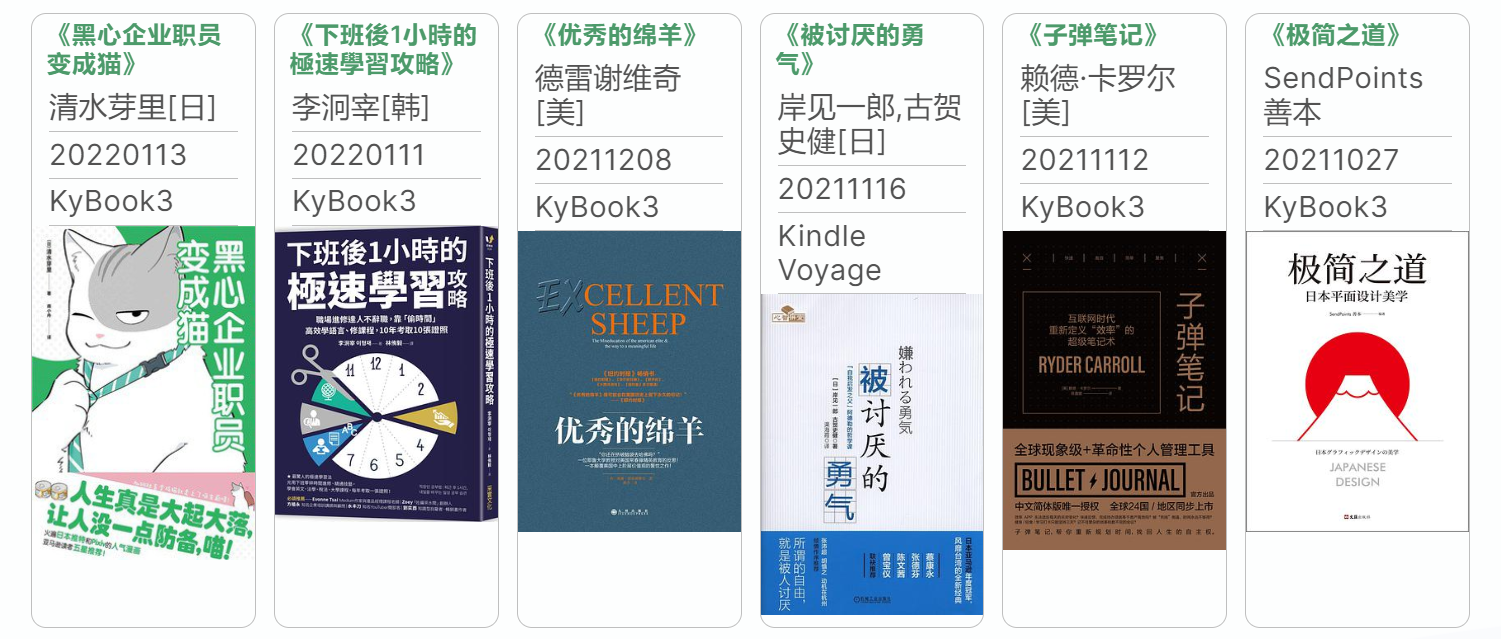
设置 —— 外观 —— CSS 代码片段 —— 打开所在文件夹 —— 新增 minimal-card.css
/* @settings
name: Minimal list-Cards
id: minimal-cards-style
settings:
	-
		id: cards-min-width
		title: 卡片最小宽度
		type: variable-text
		default: 180px
	-
		id: cards-max-width
		title: 卡片最大宽度
		description: 默认填充可用宽度,接受有效的CSS单位
		type: variable-text
		default: 1fr
	-
		id: cards-mobile-width
		title: 移动设备上卡片最小宽度
		type: variable-text
		default: 120px
	-
		id: cards-padding
		title: 卡片内边距
		type: variable-text
		default: 1.2em
	-
		id: cards-image-height
		title: 卡片最大图片高度
		type: variable-text
		default: 400px
	-
		id: cards-border-width
		title: 卡片边框宽度
		type: variable-text
		default: 1px
	-
		id: cards-background
		title: 卡片背景颜色
		type: variable-themed-color
		format: hex
		default-light: '#'
		default-dark: '#'
*/
body {
  --cards-min-width: 180px;
  --cards-max-width: 1fr;
  --cards-mobile-width: 120px;
  --cards-image-height: 400px;
  --cards-padding: 1.2em;
  --cards-image-fit: contain;
  --cards-background: transparent;
  --cards-border-width: 1px;
  --cards-aspect-ratio: auto;
  --cards-columns: repeat(
    auto-fit,
    minmax(var(--cards-min-width), var(--cards-max-width))
  );
}


@media (max-width: 400pt) {
  body {
    --cards-min-width: var(--cards-mobile-width);
  }
}

@media (min-width: 400pt) {
  .cards-cols-3 {
    --cards-columns: repeat(3, minmax(0, 1fr));
  }
  .cards-cols-4 {
    --cards-columns: repeat(4, minmax(0, 1fr));
  }
  .cards-cols-5 {
    --cards-columns: repeat(5, minmax(0, 1fr));
  }
  .cards-cols-6 {
    --cards-columns: repeat(6, minmax(0, 1fr));
  }
  .cards-cols-7 {
    --cards-columns: repeat(7, minmax(0, 1fr));
  }
  .cards-cols-8 {
    --cards-columns: repeat(8, minmax(0, 1fr));
  }
}

@media (max-width: 400pt) {
  body {
    --cards-min-width: var(--cards-mobile-width);
  }
}
.cards.table-100 table.dataview tbody,
.table-100 .cards table.dataview tbody {
  padding: 0.25rem 0.75rem;
}
.cards table.dataview {
  --table-width: 100%;
  --table-edge-cell-padding-first: calc(var(--cards-padding) / 2);
  --table-edge-cell-padding-last: calc(var(--cards-padding) / 2);
  --table-cell-padding: calc(var(--cards-padding) / 3)
    calc(var(--cards-padding) / 2);
  line-height: 1.3;
}
.cards table.dataview tbody {
  clear: both;
  padding: 0.5rem 0;
  display: grid;
  grid-template-columns: var(--cards-columns);
  grid-column-gap: 0.75rem;
  grid-row-gap: 0.75rem;
}
.cards table.dataview > tbody > tr {
  background-color: var(--cards-background);
  border: var(--cards-border-width) solid var(--background-modifier-border);
  display: flex;
  flex-direction: column;
  margin: 0;
  padding: 0 0 calc(var(--cards-padding) / 3) 0;
  border-radius: 6px;
  overflow: hidden;
  transition: box-shadow 0.15s linear;
  max-width: var(--cards-max-width);
}
.cards table.dataview > tbody > tr:hover {
  border: var(--cards-border-width) solid
    var(--background-modifier-border-hover);
  box-shadow: 0 4px 6px 0 rgba(0, 0, 0, 0.05),
    0 1px 3px 1px rgba(0, 0, 0, 0.025);
  transition: box-shadow 0.15s linear;
}
.cards table.dataview tbody > tr > td:first-child {
  font-weight: var(--bold-weight);
  border: none;
}
.cards table.dataview tbody > tr > td:first-child a {
  display: block;
}
.cards table.dataview tbody > tr > td:last-child {
  border: none;
}
.cards table.dataview tbody > tr > td:not(:first-child) {
  font-size: calc(var(--table-text-size) * 0.9);
  color: var(--text-muted);
}
.cards table.dataview tbody > tr > td > * {
  padding: calc(var(--cards-padding) / 3) 0;
}
.cards table.dataview tbody > tr > td:not(:last-child):not(:first-child) {
  padding: 4px 0;
  border-bottom: 1px solid var(--background-modifier-border);
  width: calc(100% - var(--cards-padding));
  margin: 0 calc(var(--cards-padding) / 2);
}
.cards table.dataview tbody > tr > td a {
  text-decoration: none;
}
.cards table.dataview tbody > tr > td > button {
  width: 100%;
  margin: calc(var(--cards-padding) / 2) 0;
}
.cards table.dataview tbody > tr > td:last-child > button {
  margin-bottom: calc(var(--cards-padding) / 6);
}
.cards table.dataview tbody > tr > td > ul {
  width: 100%;
  padding: 0.25em 0 !important;
  margin: 0 auto !important;
}
.cards table.dataview tbody > tr > td:has(img) {
  padding: 0 !important;
  background-color: var(--background-secondary);
  display: block;
  margin: 0;
  width: 100%;
}
.cards table.dataview tbody > tr > td img {
  aspect-ratio: var(--cards-aspect-ratio);
  width: 100%;
  object-fit: var(--cards-image-fit);
  max-height: var(--cards-image-height);
  background-color: var(--background-secondary);
  vertical-align: bottom;
}
.markdown-source-view.mod-cm6.cards
  .dataview.table-view-table
  > tbody
  > tr
  > td,
.trim-cols .cards table.dataview tbody > tr > td {
  white-space: normal;
}
.links-int-on .cards table {
  --link-decoration: none;
}
.markdown-source-view.mod-cm6.cards .edit-block-button {
  top: 0;
}
.cards.table-100 table.dataview thead > tr,
.table-100 .cards table.dataview thead > tr {
  right: 0.75rem;
}
.cards.table-100 table.dataview thead:before,
.table-100 .cards table.dataview thead:before {
  margin-right: 0.75rem;
}
.theme-light .cards table.dataview thead:before {
  background-image: url('data:image/svg+xml;utf8,<svg xmlns="http://www.w3.org/2000/svg" fill="none" viewBox="0 0 100 100"><path fill="black" d="M49.792 33.125l-5.892 5.892L33.333 28.45V83.333H25V28.45L14.438 39.017L8.542 33.125L29.167 12.5l20.625 20.625zm41.667 33.75L70.833 87.5l-20.625 -20.625l5.892 -5.892l10.571 10.567L66.667 16.667h8.333v54.883l10.567 -10.567l5.892 5.892z"></path></svg>');
}
.cards table.dataview thead {
  user-select: none;
  width: 180px;
  display: block;
  float: right;
  position: relative;
  text-align: right;
  height: 24px;
  padding-bottom: 0;
}
.cards table.dataview thead:hover:before {
  opacity: 0.5;
  background-color: var(--background-modifier-hover);
}
.cards table.dataview thead:before {
  content: "";
  position: absolute;
  right: 0;
  top: 0;
  width: 10px;
  height: 16px;
  background-repeat: no-repeat;
  cursor: var(--cursor);
  text-align: right;
  padding: var(--size-4-1) var(--size-4-2);
  margin-bottom: 2px;
  border-radius: var(--radius-s);
  font-weight: 500;
  font-size: var(--font-adaptive-small);
  opacity: 0.25;
  background-position: center center;
  background-size: 16px;
  background-image: url('data:image/svg+xml;utf8,<svg xmlns="http://www.w3.org/2000/svg" fill="none" viewBox="0 0 100 100"><path fill="white" d="M49.792 33.125l-5.892 5.892L33.333 28.45V83.333H25V28.45L14.438 39.017L8.542 33.125L29.167 12.5l20.625 20.625zm41.667 33.75L70.833 87.5l-20.625 -20.625l5.892 -5.892l10.571 10.567L66.667 16.667h8.333v54.883l10.567 -10.567l5.892 5.892z"></path></svg>');
}
.cards table.dataview thead > tr {
  top: -1px;
  position: absolute;
  display: none;
  z-index: 9;
  border: 1px solid var(--background-modifier-border-hover);
  background-color: var(--background-secondary);
  box-shadow: var(--shadow-s);
  padding: 6px;
  border-radius: var(--radius-m);
  flex-direction: column;
  margin: 24px 0 0 0;
  width: 100%;
}
.cards table.dataview thead:hover > tr {
  display: flex;
}
.cards table.dataview thead > tr > th {
  display: block;
  padding: 3px 30px 3px 6px !important;
  border-radius: var(--radius-s);
  width: 100%;
  font-weight: 400;
  color: var(--text-normal);
  cursor: var(--cursor);
  border: none;
  font-size: var(--font-ui-small);
}
.cards table.dataview thead > tr > th[sortable-style="sortable-asc"],
.cards table.dataview thead > tr > th[sortable-style="sortable-desc"] {
  color: var(--text-normal);
}
.cards table.dataview thead > tr > th:hover {
  color: var(--text-normal);
  background-color: var(--background-modifier-hover);
}
.cards.cards-align-bottom table.dataview tbody > tr > td:last-child,
.list-cards.cards-align-bottom table.dataview tbody > tr > td:last-child {
  align-items: flex-end;
  flex-grow: 1;
}
@media (max-width: 400pt) {
  .cards table.dataview tbody > tr > td:not(:first-child) {
    font-size: 80%;
  }
}

table.dataview ul.dataview-ul {
  list-style: none;
  padding-inline-start: 0;
  margin-block-start: 0em !important;
  margin-block-end: 0em !important;
}

.list-cards.markdown-preview-view .list-bullet,
.list-cards.markdown-preview-view .list-collapse-indicator,
.list-cards.markdown-preview-view.markdown-rendered.show-indentation-guide
  li
  > ul::before {
  display: none;
}
.list-cards.markdown-preview-view div > ul {
  display: grid;
  gap: 0.75rem;
  grid-template-columns: var(--cards-columns);
  padding: 0;
  line-height: var(--line-height-tight);
}
.list-cards.markdown-preview-view div > ul > li {
  background-color: var(--cards-background);
  padding: calc(var(--cards-padding) / 2);
  border-radius: var(--radius-s);
  border: var(--cards-border-width) solid var(--background-modifier-border);
  overflow: hidden;
}
.list-cards.markdown-preview-view div > ul .image-embed {
  padding: 0;
  display: block;
  background-color: var(--background-secondary);
  border-radius: var(--image-radius);
}
.list-cards.markdown-preview-view div > ul .image-embed img {
  aspect-ratio: var(--cards-aspect-ratio);
  object-fit: var(--cards-image-fit);
  max-height: var(--cards-image-height);
  background-color: var(--background-secondary);
  vertical-align: bottom;
}
.list-cards.markdown-preview-view div > ul > li > a {
  --link-decoration: none;
  --link-external-decoration: none;
  font-weight: var(--bold-weight);
}
.list-cards.markdown-preview-view div ul > li:hover {
  border-color: var(--background-modifier-border-hover);
}
.list-cards.markdown-preview-view div ul ul {
  display: block;
  width: 100%;
  color: var(--text-muted);
  font-size: var(--font-smallest);
  margin: calc(var(--cards-padding) / -4) 0;
  padding: calc(var(--cards-padding) / 2) 0;
}
.list-cards.markdown-preview-view div ul ul ul {
  padding-bottom: calc(var(--cards-padding) / 4);
}
.list-cards.markdown-preview-view div ul ul > li {
  display: block;
}
.cards.cards-16-9,
.list-cards.cards-16-9 {
  --cards-aspect-ratio: 16/9;
}
.cards.cards-1-1,
.list-cards.cards-1-1 {
  --cards-aspect-ratio: 1/1;
}
.cards.cards-2-1,
.list-cards.cards-2-1 {
  --cards-aspect-ratio: 2/1;
}
.cards.cards-2-3,
.list-cards.cards-2-3 {
  --cards-aspect-ratio: 2/3;
}
.cards.cards-cols-1,
.list-cards.cards-cols-1 {
  --cards-columns: repeat(1, minmax(0, 1fr));
}
.cards.cards-cols-2,
.list-cards.cards-cols-2 {
  --cards-columns: repeat(2, minmax(0, 1fr));
}
.cards.cards-cover,
.list-cards.cards-cover {
  --cards-image-fit: cover;
}
.cards.cards-align-bottom table.dataview tbody > tr > td:last-child,
.list-cards.cards-align-bottom table.dataview tbody > tr > td:last-child {
  align-items: flex-end;
  flex-grow: 1;
}
安利
最后,放一下最近发现的好东西:
AITDK.com
:为您的网站生成 SEO 友好的标题、描述和关键词。
HLB站缓存合并 :Android 上将 bilibili 缓存视频合并导出为 mp4,支持安卓 5.0 ~ 13,视频挂载弹幕播放(还可以搭配 弹弹play 同样实现本地带弹幕播放,弹弹play 还可以通过磁链播放:ACG.RIP 、菲特动漫 )。
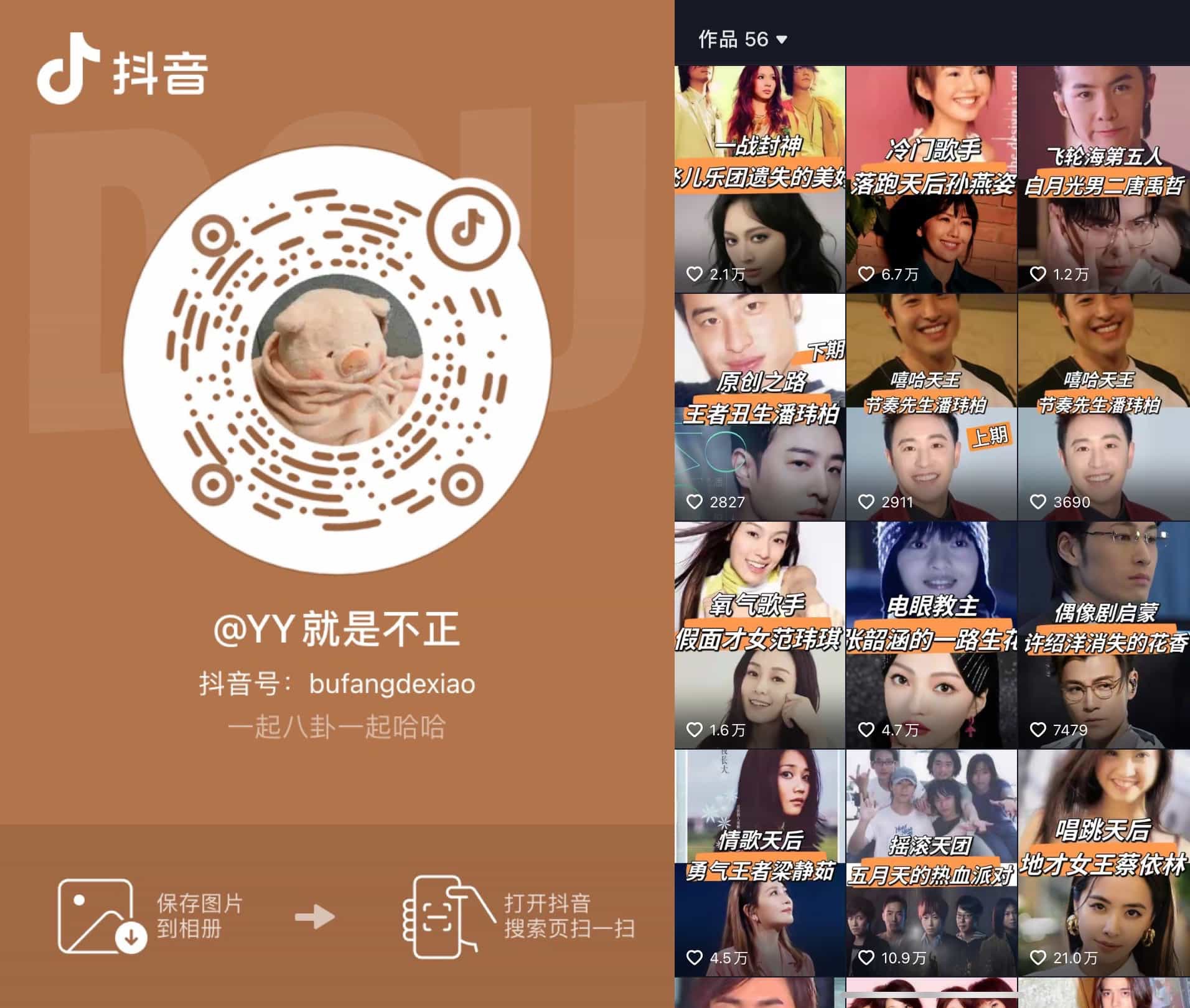
抖音@YY就是不正:介绍港台各歌手发展历程,每次看完歌单都会充实一点。
注:封面来自 Nature 150 Interactive 截图。